Making Easy finding
a home in Mexico

Lo-Fi Sketches
To help communicate information about users that I collected during research, I created a persona based on User #Based on the established pain points, I sketched multiple options to test and see which one would be more intuitive for the user and optimize the experience. During the iteration I continued refereeing to the target users, company mission and the goal on how to improve and modernized the real estate market experience.
Challenge: Discover pain point for the house hunter market in Mexico and propose solutions to improve the experience through a mobile application
Deliverables: Challenge. User Research Report. Persona. Task Flow. Sketches. Prototype. Conclusion.
Introduction
Title: House Hunting App – proposing solutions to improve the real estate experience for the house hunter market in Mexico, via a mobile app
Timeline: January – February 2022
Problem Statement: One of the major challenges in finding a house to rent or buy is the inconsistency in formats and information across various platforms (websites and apps). By consolidating this data with accurate pictures and providing easy access to agents, we aim to enhance the house hunting advertisement method and improve the overall experience for house hunters.

Background
Based on https://www.globalpropertyguide.com and the latest research of 2021, the secret for Mexico’s housing market remains robust is due to the enormously strong domestic market, particularly among the rising middle class. In 2020, the country’s middle class was estimated to account for almost half of the total households, at about 16 million. They are expected to continue growing, with about 3.8 million more households projected to move into the middle class by 2030. Moreover, most Mexicans who move generally prefer to buy rather than to rent. Around 82% of Mexicans want to buy a property, as opposed to 18% that prefer to rent, according to Lamudi.
But not only domestic market is strong foreign demand is also robust. Despite the pandemic, American and Canadian buyers continue to return to Mexico, after a several-year slump, thanks to low oil prices and the strong US dollar, pushing home values up. More than 1 million Americans live in Mexico, and more than 500,000 own homes in the country, according to a Forbes article. In fact an earlier article published by Point2 Homes ranked Mexico first among 30 favorite US and Canadian destinations for second home searches. Some of the most sought-after Mexican destinations on Google include Puerto Vallarta, Cancun, Playa del Carmen, Cabo San Lucas, and San Miguel de Allende.
Solution
The challenge is to understand the needs, pain points and the demographic of the region to adequate and develop a more efficient real estate mobile application. Facilitating agents with a direct contact with users, engaging with agents, buyers, tenants and homeowners.
For the initial user research, I conducted a guerrilla usability testing to understand the current problems.
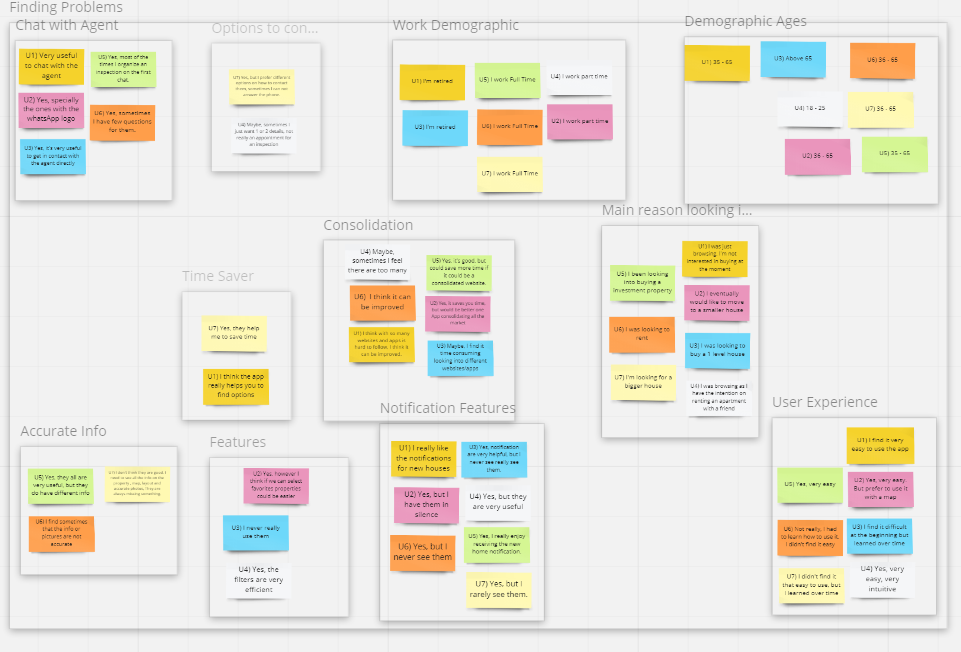
During the synthesize phase, I used affinity diagram, once identifying the grouping and forging connections, after that I analyzed the pain points and determine priorities.
Then I generate task flow to understand where in the process users were having troubles, after that I created a Lo-Fi and a Hight- Fi clickable prototype.
Lastly, I follow the user’s interaction with the application to confirm pain point, iterate, solve and redesign. Now let’s go step by step with the process.
Process

I initially conducted research to identify who the users are, their requirements when searching for a property, and the difficulties they encounter in making appointments with agents to arrange inspections.
Research
For the Guerrilla usability test, I spoke with 7 people (age range between 18- 80 years old). Sitting down with users, I ask them to complete 3 different tasks, to verify how they interact with the app
Login
Rent a house
Buy a House
Main Learnings:
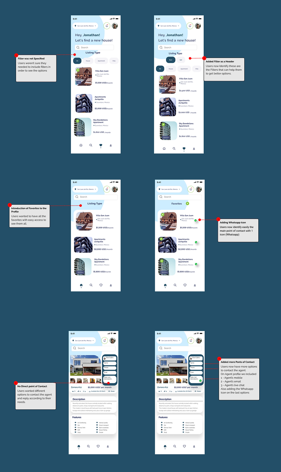
Users were not accustomed to using the filters.
Users would like to have different options on how to contact the agent
The app has a wide demographic range, spanning from 18 to 75 years old.
Within this demographic, there are varying levels of tech-savviness.
Guerilla Usability Testing

I began by consolidating all the research data into interview notes and then integrated them into an Affinity Diagram. Once I identified groupings and established connections, I developed a Themes & Opportunities map. Finally, I concluded with a Feature Prioritization Frame. The objective was to comprehensively understand the users' needs and seamlessly translate them into design opportunities.
I synthesized my finding under 3 categories based on the main business functions of House Hunting App:
Buy Houses
Rent Houses
Get agents to get on board using the app
The findings of my research were organized on the Feature Prioritization Frame to better understand the relationship to each other and to determine priorities moving forward in the process.
Based on the study, here are 5 problems I decided to focus on:
Make agents use the app as their primary option
Adding different options to contact the real estate Agent
Difficult to find information. Need to consolidate info on house profile
Have accurate photos and information
Adding better filters. Need to incorporate them in a more intuitive place.
Synthesis
Task Flow
I created a task flow for a user, when typically goes through 3 common tasks:
User wants to log in
User wants to rent a house
User wants to buy a house
To better understand where in the process users were having trouble, I highlighted the areas in purple where most users struggled, where I want to focus most during the redesign.
Ideate
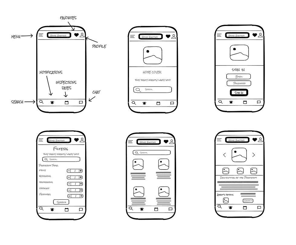
Screen Comparison
The next step in turning my Lo- Fi Prototype into Hi-Fi Prototype, was incorporating the changes needed as requested by users. Below are the screen comparison side by side, explaining each change.
Prototype
Hi-Fi Prototype
Moving forward with the process, I turned my Lo-Fi sketches into a Hi-Fi Prototype.
Click here to view the prototype
Validate
Based on the required changes, we asked 7 new users to test the clickable prototype and find out if users experience was improved with the changes.

Conclusion
After 4 weeks of user research, analysis and redesign, I was able to validate the assumptions and the changes that I had made. I did a testing with a clickable prototype with new users.
The results are:
Searching for properties was easier
Filters were introduced from the beginning of the search
Contact agents increased due to the different methods
Settling inspection also increased
Adding favorites was easier
Tackling Challenges
One of the biggest challenges that we encountered was that our demographic and user profile its quite broad, (age range is from 18 – 80 years, males and females), therefore tech-savvy skills are variable on all users. Which meant that the mobile experience had to be easier than others apps
Or second challenge was that many of the user were only browning and not getting in touch with the agent, we added different channels for user to contact agent at their convenience.
Incorporate all those different communication channels for the agent to reply accordingly.
Tackling Opportunities
With the challenges that we face we also benefit from the outcomes and creating opportunities. We envision to consolidate different features that users needed in order to get better options, however getting agents on board including different points of contact with them increased on the numbers of inspections.
Retrospective